Showing posts with label histogram. Show all posts

Thursday, April 4, 2013

plotting multiple histograms arranged in facets (trallis type) in Excel using RExcel with (with KMggplot2 plugins)

See the related posts on RExcel (for basic, Excel 2003 and Excel 2007) for basic information.

We discussed how we can use RExcel in previous posts and we used RExcel we generate voilin box plot and plots. Following the similar steps we can generate mutiple histograms, arranged compact in trallis type fashion.

(1) First load R and then R commander to see R menu in Excel (see previous posts)

(2) Following example uses dataset cabages from the R dataset library. Load the data.

(3) KMggplot2 (unlike other menus is not activated as such), you need to go to tools and then click Load Pug-ins and then select RcmdrPlugin.KMggplot2. It will promt you to restart Rcmcdr click OK. Now you can see a menu with KMggplot2 in your RExcel menus.

(3) Now click  Histogram under KMggplot2 menu. You can see the histogram  box where we have specify different parameters inclusing variable to be plotted, which variable is in rows or columns in facets etc.


See now you have histograms nice looking !

You can density curve over the histograms, also you can also include heatmap within the histogram (cool !) - just click Desnity estimation and or heatmap under options . We are using different variable to pick in the following example.


Wednesday, April 3, 2013

Histogram and stem leaf plot in Excel using RExcel

See the related posts on RExcel (for basic, Excel 2003 and Excel 2007) for basic information.

It is very easy to plot histogram using RExcel in Excel. Please follow previous posts regarding RExcel installation, loading and data reading. We will use the ready data - variable to demostrate how to create histogram.

Once the data is loaded, select Graphics then histograms. Select the variable you want to create histogram from.You can change number of bins or used auto. Also you can choose whether you want density or exact count (Frequency) or percentages in Y axis. Click OK.


In the sameway we can create stem-leaf plot. From Graphics menus select stem and leaf plot. Then select a variable and other parameters in dialog box and click OK.


The output is not something fancy graph, rather on the script window like this.


Scatter plot matrix in Excel (using RExcel) - plotting histograms or density plot with XY scatter plot

See the related posts on RExcel (for basic, Excel 2003 and Excel 2007) for basic information.

When there are large number of variables we want to see how they are distributed whereas how they are related with each other. Scatter plot matrix is greatway to do it.

(1) We will use the same data we used in previous post, please refere it too see how we can load data and work in RExcel (link is here).

(2) Under graphs menu click scatter plot matrix. Now select the variables you want to plot in scatter plot matrix. You can choose different distribution plots (eg. density, histogram, boxplot, Normal Q-Q plot, one dimensional scatter plot, or even nothing). You have choose whether to plot smoothed line or not. You can accept defaults. Let's say we select 7 variables (V1 to V7).

You can see the plots nicely arranged.

Here are with histogram, boxplot, normal Q-Q plot  in the center.


Tuesday, April 2, 2013

Extend your Excel graphics capabilities using R-Excel - no programming knowledge needed !

RExcel extends graphical capability of Excel - once you installed R-Excel and R program properly - you do necessarily need knowledge of R programming - most importantly R and Rexcel is free. Down side is that RExcel is only available for 2003, 2007 and 2010 Excel versions (download and instructions are here). Easiest way to install would be download the file RAndFriendsSetup2152V3.2-9-1 and follow the install steps.

The Excel add in RExcel.xla permits using R within excel in your figure tips (not necessarily need for programming skills). Here there are two types of servers - background (completely hidden from user and all of the interaction with R should be done within Excel) and foreground (you can access to R graphical user interface while working in R).  The backgound server should be installed with the R(D)COM server - which depends upon R package rcom, can be installed from Comprehensive R network. Installation is not that complicated, the above link provides packages that install everything needed.


Although there are different ways to use R within Excel, the most easy way is to use as worksheet function (R functions are called in worksheet). I think for the graphical purpose, this only can help alot to create nice graphics - extending RExcel capabilities.

The following steps are RExcel in Excel 2003. Once every thing set of correctly you can see RExcel in Add-Ins and a new menu appears before Help menu in the corner. Now under menu click run R.


Then you will see menu change and then click R commander with Excel menus. Now whole set of menu are activated for R use within excel. It includes Graphs too.


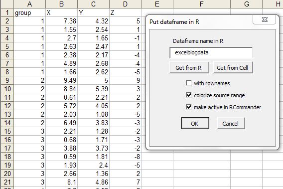
Select the data area and click put R dataframe, then it will prompt you to get the name of R dataset. So these cells will stay as R data set available for use in later sessions.


Here I have provided excelblogdata name to the dataset. The dataset name will be listed in Dataset drop down list.


Now let's do some plotting that we can not easily do in excel. Select XY conditioning plot from the Graphs menu in RExcel menu.


Now you can see nice trellis plot (uses R/lattice package) in R plot window.


Plotting 2 variables in Y axis.


Scatter plot matrix is useful when there are many variables. Here we have scatter plot matrix with histogram in the center.


.

Finally there are several other features useful for nice visualization in RExcel. Most importantly it takes some flavor of R to Excel. Happy plotting !


3D-histogram in Excel


Histogram can be both 2D and 3D. By 3D I do not mean 3D bars rather threre are two variables (X and Y and frequency is plotted in Z axis).

After  preparing data category (see the article), we can create a 3D histogram. So we need a two way frequency count table  like this:


The insert 3D column chart. We can then modify this remove gaps (looks like a block).


We can creat columns with different shape( may be just for fun !).


We can change the type to 3D- wire frame plot.


Creating population pyramid in excel

Population pyramid are overlayed histograms. First we need a frequency table with age group category versus total population (of percentage). If percentage in not calculated beforehand we can just calculate using excel formula.

Formula used to calculate % in male : =(B2/$C$19)*100.

For females, we will make the values negative, so we can do so by  multiplying with -1.

 =-1*(C2/$C$19)*100

Now we need to add 2D clustered bar.


To make the plots compact set series overlap to 100% and gap width to 0.


Now we want to get rid of the negative numbers in female side. We can format the number in the axis to postive and black, select red format for negative number and then modify red by typing black within the []

We can format the plot to your taste (for example color etc). We can convert it to area plot too by just clicking the change plot type and selecting area type.


Sometime we might want to overlay groups, in above case we plotted group1 (male and female). Now we can add group 2 by just adding data series. The calculations for group 2 are similar to group 1. Use select data source and add data series to add group2male and group2female.


You might want to add transparency to bars so that overlayed bars will not shadow to others.


Sunday, March 31, 2013

comparision of multiple histograms or density plots non-overlayed in in single plot in Excell

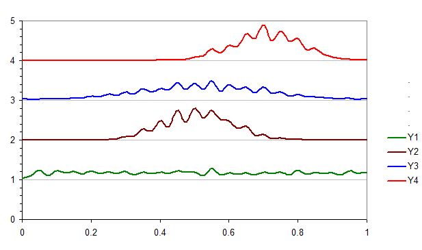
Sometime we might be interested to compare the distributions (using histogram or line plot), which are not overlayed but a series of subplot within a single plot. The following section discuss the tricks:

(1) First of all we calculate frequency for each series of data and store arranged in a table like above. Now we calculate density by dividing Frequency by total number (summation of frequncy in each column). Also calculate maximum density so that w can use this to weigh all density and calculate weighing factor that fits in the plot area. Also we need to provide a number where the Y series will be plotted. Here we have considered 1, 2,3, 4 so that the histograms will be based on 1, 2,3, 4 lines in Y axis.

(4)  Now we need weigh the density by constant factor so that they fit in 1 heigh interval in Y axis.
Here I used the formula =(0.9*(S2/$AF$3)), for example so that maximum value will be 0.9 so that there will a gap of 0.1 between Y1 and Y2, Y2 and Y3 or similarly other consequitive series plot. You can scale to 1 too but the maximum bars will then touch to another series.


(5) Now we can add XY scatter plot. Just create pseudo series with any two data series, we will modify it by secificing proper range later.


(6) Now we start editing source data. Here X value for bin range and Y is constant number where the series withing plot need to plotted (i.e. 1, 2,3,4 in our case).


Now just point plot will look like the following:
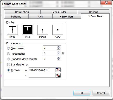
 (7) Now add the error bar to each point. Add plus error bars with custom series where height is weighted density. You want to modify the error bars without having cap.


(8) Now we can add the line to plot by adding new data series. But we need a trick, now we need to add the Y position (1,2,3,4) to the wieghted density calculated. Then you get points and convert the points to lines type XY plot.


(9) You can remove the bars if you want to by editing error bar setting to no error bars.

(10) If want to overlay one or more series (for example Y1 and Y2 in same pair, Y3 and Y4 in another ), you can change the value of y axis plotting values. For example Y1 and Y2 was set to 1 and Y3 and Y4 was set to 3 in the following plot.


Friday, March 29, 2013

Multiple histograms: Overlayed or Back to Back


We can calculate frequency with same Bins, then use then to plot histogram with grouped bar chart.  


We can overylay the histograms, with transparency. Look the following plots:


Back to back histograms 
The trick to create back to back histogram is similar to above, here we need to make the frequency negative to the series that will be plotted in the apposite side. We need to overlap the bars (perhaps in opposite direction) and optionally you can set gap width to 0. The following example are in excel 2003, tricks can be applied in similar way in another excel versions. 


Perhaps the negative number are purpose of plotting histograms, we do not want to present them as negative. We can format the axis to look like different color (such as negative appearing as red, in the following example), perhaps back to black color. Use custom format if you want negative color displayed as different color ([Blue]0;[Green]0 format will turn positive numbers to blue and negative number of green as shown in following graph or [Black]0;[Black]0 will turn the both numbers to black and remove the - sign in negative number).