Sometime we might be interested to compare the distributions (using histogram or line plot), which are not overlayed but a series of subplot within a single plot. The following section discuss the tricks:
 (1) First of all we calculate frequency for each series of data and store arranged in a table like above. Now we calculate density by dividing Frequency by total number (summation of frequncy in each column). Also calculate maximum density so that w can use this to weigh all density and calculate weighing factor that fits in the plot area. Also we need to provide a number where the Y series will be plotted. Here we have considered 1, 2,3, 4 so that the histograms will be based on 1, 2,3, 4 lines in Y axis.

(4) Now we need weigh the density by constant factor so that they fit in 1 heigh interval in Y axis.
Here I used the formula =(0.9*(S2/$AF$3)), for example so that maximum value will be 0.9 so that there will a gap of 0.1 between Y1 and Y2, Y2 and Y3 or similarly other consequitive series plot. You can scale to 1 too but the maximum bars will then touch to another series.


(6) Now we start editing source data. Here X value for bin range and Y is constant number where the series withing plot need to plotted (i.e. 1, 2,3,4 in our case).

Now just point plot will look like the following:
 (7) Now add the error bar to each point. Add plus error bars with custom series where height is weighted density. You want to modify the error bars without having cap.
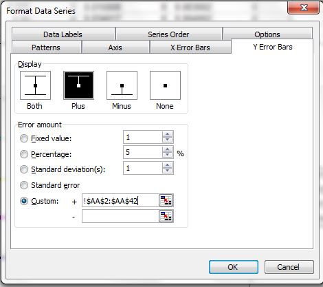


(9) You can remove the bars if you want to by editing error bar setting to no error bars.
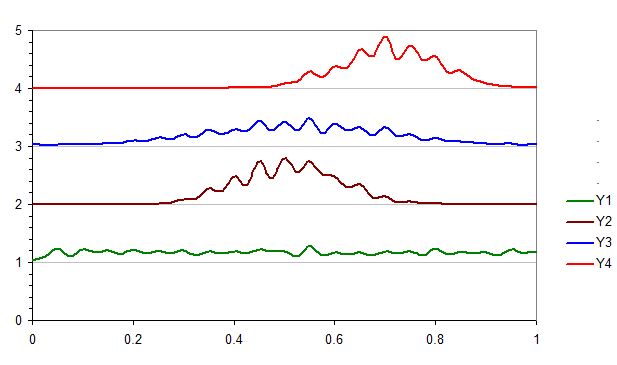
(10) If want to overlay one or more series (for example Y1 and Y2 in same pair, Y3 and Y4 in another ), you can change the value of y axis plotting values. For example Y1 and Y2 was set to 1 and Y3 and Y4 was set to 3 in the following plot.

(4) Now we need weigh the density by constant factor so that they fit in 1 heigh interval in Y axis.
Here I used the formula =(0.9*(S2/$AF$3)), for example so that maximum value will be 0.9 so that there will a gap of 0.1 between Y1 and Y2, Y2 and Y3 or similarly other consequitive series plot. You can scale to 1 too but the maximum bars will then touch to another series.
(5) Now we can add XY scatter plot. Just create pseudo series with any two data series, we will modify it by secificing proper range later.(6) Now we start editing source data. Here X value for bin range and Y is constant number where the series withing plot need to plotted (i.e. 1, 2,3,4 in our case).
Now just point plot will look like the following:
(8) Now we can add the line to plot by adding new data series. But we need a trick, now we need to add the Y position (1,2,3,4) to the wieghted density calculated. Then you get points and convert the points to lines type XY plot.
(10) If want to overlay one or more series (for example Y1 and Y2 in same pair, Y3 and Y4 in another ), you can change the value of y axis plotting values. For example Y1 and Y2 was set to 1 and Y3 and Y4 was set to 3 in the following plot.


