Showing posts with label XY Scatter Plot. Show all posts

Thursday, April 4, 2013

plotting multiple scatter plots arranged in facets (trallis type) in Excel using RExcel with (with KMggplot2 plugins)

See the related posts on RExcel (for basic, Excel 2003 and Excel 2007) for basic information.

In previous post we created mutiple histograms arrange in row and column (facets, trallis type plots), we can do the same for the scatter plot using RExcel with (with KMggplot2 plugins). Basic step in data loading etc are same. We will use the same cabbage dataset  to deomstrate how we can do this.

 Data is loaded and active, we need to check histograms under KMggplot2 menu. Now we have choice for X variable, Y variable, stratum variable, Facet variable in row or column direction. We can add smoothing curves or opt out by clicking none.


See the nicely arranged publication ready graphs:


Wednesday, April 3, 2013

Scatter plot matrix in Excel (using RExcel) - plotting histograms or density plot with XY scatter plot

See the related posts on RExcel (for basic, Excel 2003 and Excel 2007) for basic information.

When there are large number of variables we want to see how they are distributed whereas how they are related with each other. Scatter plot matrix is greatway to do it.

(1) We will use the same data we used in previous post, please refere it too see how we can load data and work in RExcel (link is here).

(2) Under graphs menu click scatter plot matrix. Now select the variables you want to plot in scatter plot matrix. You can choose different distribution plots (eg. density, histogram, boxplot, Normal Q-Q plot, one dimensional scatter plot, or even nothing). You have choose whether to plot smoothed line or not. You can accept defaults. Let's say we select 7 variables (V1 to V7).

You can see the plots nicely arranged.

Here are with histogram, boxplot, normal Q-Q plot  in the center.


Tuesday, April 2, 2013

Extend your Excel graphics capabilities using R-Excel - no programming knowledge needed !

RExcel extends graphical capability of Excel - once you installed R-Excel and R program properly - you do necessarily need knowledge of R programming - most importantly R and Rexcel is free. Down side is that RExcel is only available for 2003, 2007 and 2010 Excel versions (download and instructions are here). Easiest way to install would be download the file RAndFriendsSetup2152V3.2-9-1 and follow the install steps.

The Excel add in RExcel.xla permits using R within excel in your figure tips (not necessarily need for programming skills). Here there are two types of servers - background (completely hidden from user and all of the interaction with R should be done within Excel) and foreground (you can access to R graphical user interface while working in R).  The backgound server should be installed with the R(D)COM server - which depends upon R package rcom, can be installed from Comprehensive R network. Installation is not that complicated, the above link provides packages that install everything needed.


Although there are different ways to use R within Excel, the most easy way is to use as worksheet function (R functions are called in worksheet). I think for the graphical purpose, this only can help alot to create nice graphics - extending RExcel capabilities.

The following steps are RExcel in Excel 2003. Once every thing set of correctly you can see RExcel in Add-Ins and a new menu appears before Help menu in the corner. Now under menu click run R.


Then you will see menu change and then click R commander with Excel menus. Now whole set of menu are activated for R use within excel. It includes Graphs too.


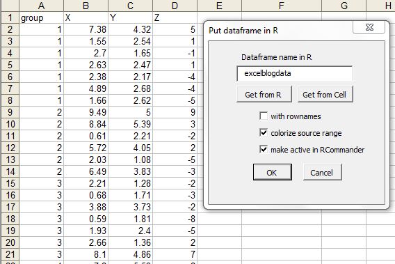
Select the data area and click put R dataframe, then it will prompt you to get the name of R dataset. So these cells will stay as R data set available for use in later sessions.


Here I have provided excelblogdata name to the dataset. The dataset name will be listed in Dataset drop down list.


Now let's do some plotting that we can not easily do in excel. Select XY conditioning plot from the Graphs menu in RExcel menu.


Now you can see nice trellis plot (uses R/lattice package) in R plot window.


Plotting 2 variables in Y axis.


Scatter plot matrix is useful when there are many variables. Here we have scatter plot matrix with histogram in the center.


.

Finally there are several other features useful for nice visualization in RExcel. Most importantly it takes some flavor of R to Excel. Happy plotting !


Monday, April 1, 2013

simple graphs with excel - things you know or might not know !

Excel is most frequently used for spread sheet application. When comes to graphics, it does great quality graphs however does not do what advanced user need to. However, many time we under estimate its ability and switch to less user-friendly and / or lower quality graphics software  In this post we will discuss on very simple graphics that excel can do (check if something is new for you):

(1) XY scatter plot
This is most common and informative graph in scientific world as it can compare two variable.


In scatter plot many times we want to add prediction lines with associate model. We can add more than one Y variable so that we can make comparison in trend.


(B) Bar (Row or Column Plots)
Bar plots are useful when categorical variable is plotted with a  numerical variable. Even if we want to plot numerical with numerical variable - one must be treated as categorical so that the bars are spaced as equal distance (not based on difference between them).


Sometime we might want to have some fancy looking 3D bar plots. They do not necessarily augment the plots, but looks nice for business charts .. 


(C) Line plot 
Line plot work in the same way as bar plot, however the lines are connected, useful to see a trend. In contrast XY plot where both axis are quantitative, here one variable is categorical. 


We can convert any of line series to bar chart so that we can represent one variable as bar and another as line. 


(D) Area plot:
Area plots are suitable in some cases where we are interested in looking area under the curve. We can overlay more than one series in the same plot. 


(E) Pie chart:
Pie chart  are also popular in business charts, however their suitability in science is much argued. They are useful show composition or share of total (like percent).


Some resources: 

(1) Basic idea on how to plot graph and edit its components, see this video. Here is another video tutorial that shows how to add error bars to the plot. 


(3) Video showing how we can plot multiple plot in single chart with additional axis


Saturday, March 30, 2013

XY plots (tricks and modifications)

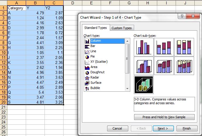
XY scatter plot


XY Polt (scatter or line or combination) has both X and Y quantative values. The lines can be drawn, connected by smoothing based on data trend or directly connected as such.


We can just combine all of the different variations within single plot, just by selecting a series and change the chart type.  In the following case only Y2 is changed to smoothed line:


We can add error bars (specified from a series or fixed amount to the plot)


Connect the lines, in desirable connect.