Showing posts with label error bar plot. Show all posts

Wednesday, April 3, 2013

Mean Plot (line and error bar plot) in Excel using RExcel

See the related posts on RExcel (for basic, Excel 2003 and Excel 2007) for basic information.

We already discussed in previous posts that how to install RExcel to how to load a data.

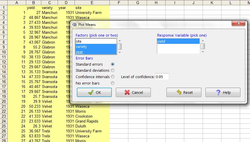
Let's get a data, here I am loading barley data from R/lattice library.  The data is in the long form (unlike many datasets in Excel), data with many treatments or replications or samples are arranged this way. Calculating means, standard errors etc is difficults. RExcel can quickly do for you and generate publication ready graphs.

We can select one or two factors and one numeric response variable.


Mean by single factor variety.


Creating dynamic range plots in Excel

What are dynamic range charts ?

In a chart we must specify the range from which chart need to be plotted. However, in some situations we want a dynamic range - the range of data input either grow or shrink -

Dynamic range charts are such charts that updated automatically if  input data range is changed.

Then how can we do that ?

In excel 2003 or above you can create a data table,  with table if you add or remove any rows the chart gets automatically updated.

Creating a table in Excel 2013:

 Click format at table after selecting the region of interest.


Once clicking OK, the sheet works as dynamic range. For example I added some X variables and the plot got updated automatically.


Perhaps the above is simpler way to create a dynamic range. You can also use Offset function.

Tuesday, April 2, 2013

create stock chart in excel

Excel has very nice functions to plot stocks. Here is an example on how to plot Open-high-low-close type stock plot. We need the columns in same order - date, followed by open-high-low-close. Under stock select stock and subtype: open-high-low-close . 


Now we got the plot:


Now policing the plot to get final product. Now we can format the data series display and color etc. We might want to get rid of legend.


In similar way we can create High-low-close type stock chart.  


Creating strip plot in excel

In strip plot we have vertical or horizontal lines spaced at particular values in X or Y. In case multiple strip plots the value in  X and Y axis just are meant to plot the strips.

Here is a trick to develop strip plot using XY scatter plot with error bars.

(1) First of all add simple scatter plot, SN is a dummy variable with serial number. We need to edit the data source.


(2)  Now we want to plot strips in X axis, while the series A, B, C, D in Y axis, So now I created a dummy variable for place where these A, B, C, D will be positioned - i.e. 1, 2, 3, 4 in Y axis.  X value will be columns labeled with A, B, C,D while Y value will dummy constant 1, 2,3,4 for each series respectively.

(3) Now we need to add error bars in Y axis, remove X axis bars. Use a fixed value depending upon how long bar you like to see (for example 0.2), plus and minus bars. Remove bar cap and change the color and size whatever you like to. Remove the points and keep just error bars. You can connect the bars with lines too.


The strip plots are ready. If you like to change the strip length by thrid variable, you can do so by simple trick.


Sunday, March 31, 2013

create line plot with error bar plot in excel


XY Error bar plot:

Adding error bars to XY plot is simple task in excel. First we need to plot XY scatter plot with subtype scatter with data points connected by lines without markers.


(2) The format series and find Y error bars to be added (we can also add X error bars in the same way). You can specify different types of errors (fixed such as standard deviation or fixed value or percentage of the value) or user specified in error column (for example SE in above case).


Saturday, March 30, 2013

XY plots (tricks and modifications)

XY scatter plot


XY Polt (scatter or line or combination) has both X and Y quantative values. The lines can be drawn, connected by smoothing based on data trend or directly connected as such.


We can just combine all of the different variations within single plot, just by selecting a series and change the chart type.  In the following case only Y2 is changed to smoothed line:


We can add error bars (specified from a series or fixed amount to the plot)


Connect the lines, in desirable connect.


Friday, March 29, 2013

Some tricks in Barplot

Barplot (column or row bar plots)


How to change negative number to different color or back to black number in axis:


Similarly we can create horizontal and vertical bars:


Adding lines to barplots:

If we like a to add new series and add series lines to all barplots,  the following is way to go:


However in many time we just want only or others represented as lines other as bars. Then let's do overlayed bar, select the series only and then change the plot type.


Adding error bars:
Click Format the data series where we want to add the error bar to.


With 2003 it is not possible to add separate labels such as mean comparisons  but is possible in excel 2013 it is possible to do so.


Grouped bars:

Over stacked bars, grouped bars provide side by side comparisions of the series.


We can add a number of series and then convert the series to different chart type (for example line type).


Sometime we might want to plot a constant line (such as representing a threshold), we can do so by just specifying a series with just a single value and plot this as line type. Note that the place of series affects the start and end point of the line.


 We can add the error bars to the data series we want to add to. We can specify error amount as fixed value or from a column.


A busy plot will look like the following:
Perhaps overlayed plot will be more suitable for this kind data where sum of the series is 1 (100%) and each component is composition of the whole:


Wednesday, March 27, 2013

fitting curve in excel


 Curve fitting:


(1) Create a scatter plot and select series and select add trend line


(2) If you like to see R square and equation on the plot, check the boxes. You can also set intercept. You can repeat this for each series and also more than one curve for each series


(3) You can plot deviations (errors for each model - i.e. difference between predicted and observed) as shown in above chart.
For this you need to create a new column for predicted values using a formula based on the equation displayed:

for example:
predY2(Power)  =(0.0711*A2^2.1331)

predY1 =(0.6412*A2+1.8667)

Then calculate the difference between Y2 (observed and predicted):
DeviationY2power = (C2-D2)
DeviationY1 = (B2-E2)

Now we want to add error bars and add to minus side only and select the difference range.


(4) Beside the provided equations, we can also fit own equation. For example if we are interested to plot two equations:
y = 55 + x0
y = 7.8x-95

Now we need to create a new series calculating the expected observations for each level of X.
YpredE1 = 55+A2*0
YpredE2 = (7.8*A2-95)

Now add new data to the plot, go to source data, add new series. Then select the series and than again go back to chart type and select smooth line.