See the related posts on RExcel (for basic, Excel 2003 and Excel 2007) for basic information.
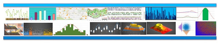
When there are large number of variables we want to see how they are distributed whereas how they are related with each other. Scatter plot matrix is greatway to do it.
(1) We will use the same data we used in previous post, please refere it too see how we can load data and work in RExcel (link is here).
(2) Under graphs menu click scatter plot matrix. Now select the variables you want to plot in scatter plot matrix. You can choose different distribution plots (eg. density, histogram, boxplot, Normal Q-Q plot, one dimensional scatter plot, or even nothing). You have choose whether to plot smoothed line or not. You can accept defaults. Let's say we select 7 variables (V1 to V7).
You can see the plots nicely arranged.
 Here are with histogram, boxplot, normal Q-Q plot in the center.


When there are large number of variables we want to see how they are distributed whereas how they are related with each other. Scatter plot matrix is greatway to do it.
(1) We will use the same data we used in previous post, please refere it too see how we can load data and work in RExcel (link is here).
(2) Under graphs menu click scatter plot matrix. Now select the variables you want to plot in scatter plot matrix. You can choose different distribution plots (eg. density, histogram, boxplot, Normal Q-Q plot, one dimensional scatter plot, or even nothing). You have choose whether to plot smoothed line or not. You can accept defaults. Let's say we select 7 variables (V1 to V7).
You can see the plots nicely arranged.
A scatter plot is another useful data visualization technique that is used to display the correlation or relationship between the two variables. Carefully created, well-designed scatter plots help you see the correlation between the complex set of data easily.
ReplyDeleteScatter plot