This is important issue to deal with if there are very large number of data points as the data points will overlap and make unable to grasp the fact that how many data points are plotted at a particular data point.
Here idea is use small point size, type of point (such as "-" or ".") or use of transparent points.

Two Y series:

Recent version of Excel allow transparency in symbols.
You can overlay summary plot like density plot or histogram to show the density of data point. Here is the trick:
Here the trick is to overlay the points of frequency generated by histogram functions from data analysis package. The frequency are enforced to be negative to plot on negative side in Y axis, off course we can add to positive side too but will overlay with more scatter plot data points. The density is calculated by dividing the frequency with total number of observations. Then density is manipulated to a maximum plotting value suitable fit to axis, for example -15 in Y axis divided by maximum density and multiplied by the density.
= (-15/ maximum density) * density

The density can be plotted as line or bar (histogram)

With similar trick we can plot the frequency points in Y axis too. See here the X and Y data are reverse here while generating the scatter plot.

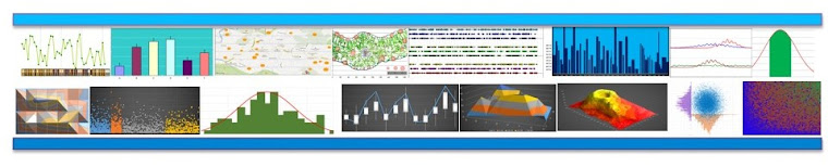
The final produce may look like the following:


We can also fit theoretical distribution to the plot.
Recent versions of Excel (eg. 2013) allow to set transparency to the point so that the point overlap is more clear.


Here idea is use small point size, type of point (such as "-" or ".") or use of transparent points.
Two Y series:
Recent version of Excel allow transparency in symbols.
You can overlay summary plot like density plot or histogram to show the density of data point. Here is the trick:
Here the trick is to overlay the points of frequency generated by histogram functions from data analysis package. The frequency are enforced to be negative to plot on negative side in Y axis, off course we can add to positive side too but will overlay with more scatter plot data points. The density is calculated by dividing the frequency with total number of observations. Then density is manipulated to a maximum plotting value suitable fit to axis, for example -15 in Y axis divided by maximum density and multiplied by the density.
= (-15/ maximum density) * density
The density can be plotted as line or bar (histogram)
With similar trick we can plot the frequency points in Y axis too. See here the X and Y data are reverse here while generating the scatter plot.
The final produce may look like the following:
We can also fit theoretical distribution to the plot.
Recent versions of Excel (eg. 2013) allow to set transparency to the point so that the point overlap is more clear.
It would have been nice if you also provided data to play with.
ReplyDelete