Showing posts with label bar plot. Show all posts

Wednesday, April 3, 2013

Creating dynamic range plots in Excel

What are dynamic range charts ?

In a chart we must specify the range from which chart need to be plotted. However, in some situations we want a dynamic range - the range of data input either grow or shrink -

Dynamic range charts are such charts that updated automatically if  input data range is changed.

Then how can we do that ?

In excel 2003 or above you can create a data table,  with table if you add or remove any rows the chart gets automatically updated.

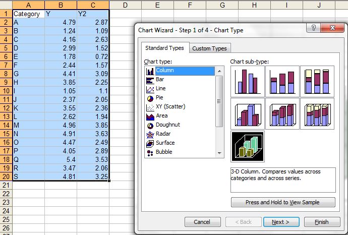
Creating a table in Excel 2013:

 Click format at table after selecting the region of interest.


Once clicking OK, the sheet works as dynamic range. For example I added some X variables and the plot got updated automatically.


Perhaps the above is simpler way to create a dynamic range. You can also use Offset function.

Tuesday, April 2, 2013

Creating population pyramid in excel

Population pyramid are overlayed histograms. First we need a frequency table with age group category versus total population (of percentage). If percentage in not calculated beforehand we can just calculate using excel formula.

Formula used to calculate % in male : =(B2/$C$19)*100.

For females, we will make the values negative, so we can do so by  multiplying with -1.

 =-1*(C2/$C$19)*100

Now we need to add 2D clustered bar.


To make the plots compact set series overlap to 100% and gap width to 0.


Now we want to get rid of the negative numbers in female side. We can format the number in the axis to postive and black, select red format for negative number and then modify red by typing black within the []

We can format the plot to your taste (for example color etc). We can convert it to area plot too by just clicking the change plot type and selecting area type.


Sometime we might want to overlay groups, in above case we plotted group1 (male and female). Now we can add group 2 by just adding data series. The calculations for group 2 are similar to group 1. Use select data source and add data series to add group2male and group2female.


You might want to add transparency to bars so that overlayed bars will not shadow to others.


Monday, April 1, 2013

simple graphs with excel - things you know or might not know !

Excel is most frequently used for spread sheet application. When comes to graphics, it does great quality graphs however does not do what advanced user need to. However, many time we under estimate its ability and switch to less user-friendly and / or lower quality graphics software  In this post we will discuss on very simple graphics that excel can do (check if something is new for you):

(1) XY scatter plot
This is most common and informative graph in scientific world as it can compare two variable.


In scatter plot many times we want to add prediction lines with associate model. We can add more than one Y variable so that we can make comparison in trend.


(B) Bar (Row or Column Plots)
Bar plots are useful when categorical variable is plotted with a  numerical variable. Even if we want to plot numerical with numerical variable - one must be treated as categorical so that the bars are spaced as equal distance (not based on difference between them).


Sometime we might want to have some fancy looking 3D bar plots. They do not necessarily augment the plots, but looks nice for business charts .. 


(C) Line plot 
Line plot work in the same way as bar plot, however the lines are connected, useful to see a trend. In contrast XY plot where both axis are quantitative, here one variable is categorical. 


We can convert any of line series to bar chart so that we can represent one variable as bar and another as line. 


(D) Area plot:
Area plots are suitable in some cases where we are interested in looking area under the curve. We can overlay more than one series in the same plot. 


(E) Pie chart:
Pie chart  are also popular in business charts, however their suitability in science is much argued. They are useful show composition or share of total (like percent).


Some resources: 

(1) Basic idea on how to plot graph and edit its components, see this video. Here is another video tutorial that shows how to add error bars to the plot. 


(3) Video showing how we can plot multiple plot in single chart with additional axis


xy bar plot (both X and Y axis are continous variables)

Usually with row or column plots in excel, one axis is categorical dat and other is numerical. However with some tricks, we can create a bar plot (row or column plot). Here is the trick.

(1) With a dummy dataset (where A column as names - not numbers and B column has number ) create a bar plot.

(2) Replace A column values with small bins created (minimum unit of data - for example 0.1 if our data is single decimal point or 1 if our data has no decimal point) in the range of Y data. Now trick is to fill Y value. For example if the width of bar is from 0.3 to 0.12 and height is 8, then we need to fill the cells like this:
X           Y
0.03 8
0.04 8
0.05 8
0.06 8
0.07 8
0.08 8
0.09 8
0.1 8
0.11 8
0.12 8

If there no data point in the X region keep it blank. Remove gap between bars by setting the series option bar gap to 0. You can manipulate labels (if over crowded) displayed after certain intervals.


In similarway we can plot stacked barplot.


Sunday, March 31, 2013

overlay plots over pictures (such as photo, diagram or maps)

Sometime we are need of overlaying the data points or bars over different types of plots. For this we need coordinates of the data points where we want to plot the data points. There are different image analysis software that can do so. Here is use of WebPlotDigitizer online free tool to do so using a leaf anatomy plot.

Examples:


(1) Plot a dummy plot. Here we are setting maximum and minimum co-ordinates to 200 in X and Y.


(2) Insert desired plot in plot area.


(3)  Now we need print and scan or take snip of the plot and save file as jpeg.


(3) Find cordinates to points in the plot  to be plotted using the image analysis software WebPlotDigitizer  :
 First load the file in the web application.


Click the 0, 200 in X-axis and 0,200 in Y axis before proceed.


Now click the point in figure where you want the data to be plotted. Once you are done you can request a csv output. See purple points are selected data points. You can cross check if it is working properly by clicking the known data points (Yellow diamonds in the following figure).


Now copy and paste in file with CVS extension (as suggested in the window) and open then paste in excel sheet.
The co-ordinates of plotting data points can found by simply guessing (for coarse work) in the plot or using some short of tracing act over printed plot. For maps (such as google maps we can find the co-ordinates of the data points)

(4)  Npw we can simply plot different types of plots - connect lines, connected lines with error bars or bubble plots over the figure. To avoid misalignment if you change any features of the data, the range of the data mush be refreshed. We need to remove the data plotted by previous dummy data set and add new series.


See the trick of plotting 4 extra points in right corner (not in anatomy area) are meant for plotting legend scales. Now the following line connected plot with error bars. Off-course we can just plot the error bars corresponding a value we want to plot.

Creating bubble plot: We can create bubble plot in similar way, which may be more useful where the size of bubble is scaled to certain factor.


A transparent version:


We can similarly overlay over map in the similar way:


Here is example with plotting in chromosomes using same trick:


We can combined with other type of plot used as picture, for example here we used add bars to the dendogram.


Just for fun, we can overlay with other type of plot in background (which is not possible in current excel) - just bars in 3D pie - 


Important Note: The scale limit in X and Y axis must be same as used while finding coordinates  otherwise the plot points will misaligned.