The following example shows plotting of a volcano data from R datasets in Excel 2013.
The data can be available from R:
data(volcano)
write.table (volcano, file = "volcano.txt")
(1) As the title of X and Y axis in excel are treated as text (not a numeric data point), the format the names as text. Please note that if the data in X and Y are quantative need to be in equal bin size for accurate display.
(2) Select data, A1:BJ88 and click stock, surfcae, radar icon. Then click 3-D surface under surface icon.

(3) Edit the axis so that plot starts at 90 at Z axis.

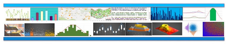
Now we change the style as many way we want. We can do 3D rotations. X rotation and Y rotation to 45 degree witll look like:

You can change the color gradiant to make sense. Click page layout and then colors, you can then define your own color or office color available that are short continoum.

There are different variations available in style. Click the chart aree you will see the chart styles in the menu to choose.

Also the chart can be converted to other 3-variable (true and psudo 3D plots):

The data can be available from R:
data(volcano)
write.table (volcano, file = "volcano.txt")
(1) As the title of X and Y axis in excel are treated as text (not a numeric data point), the format the names as text. Please note that if the data in X and Y are quantative need to be in equal bin size for accurate display.
(2) Select data, A1:BJ88 and click stock, surfcae, radar icon. Then click 3-D surface under surface icon.
(3) Edit the axis so that plot starts at 90 at Z axis.
Now we change the style as many way we want. We can do 3D rotations. X rotation and Y rotation to 45 degree witll look like:
You can change the color gradiant to make sense. Click page layout and then colors, you can then define your own color or office color available that are short continoum.
There are different variations available in style. Click the chart aree you will see the chart styles in the menu to choose.
Also the chart can be converted to other 3-variable (true and psudo 3D plots):
can you display more than 6 colours and ranges of data in Excel 2013?
ReplyDeleteI need between 64 and 255.
pat.plicki@gmail.com
can you display more than 6 colours and ranges of data in Excel 2013?
ReplyDeleteI need between 64 and 255.
pat.plicki@gmail.com
Note however there is a typo in the script.
ReplyDeletedata1 <- data.frame (X, Y, ) should read
data1 <- data.frame (X, Y)
3D Scatter Plot