Population pyramid are overlayed histograms. First we need a frequency table with age group category versus total population (of percentage). If percentage in not calculated beforehand we can just calculate using excel formula.
Formula used to calculate % in male : =(B2/$C$19)*100.
For females, we will make the values negative, so we can do so by multiplying with -1.
=-1*(C2/$C$19)*100
Now we need to add 2D clustered bar.

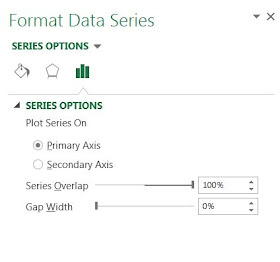
To make the plots compact set series overlap to 100% and gap width to 0.
Sometime we might want to overlay groups, in above case we plotted group1 (male and female). Now we can add group 2 by just adding data series. The calculations for group 2 are similar to group 1. Use select data source and add data series to add group2male and group2female.
You might want to add transparency to bars so that overlayed bars will not shadow to others.
Formula used to calculate % in male : =(B2/$C$19)*100.
For females, we will make the values negative, so we can do so by multiplying with -1.
=-1*(C2/$C$19)*100
Now we need to add 2D clustered bar.

To make the plots compact set series overlap to 100% and gap width to 0.
Now we want to get rid of the negative numbers in female side. We can format the number in the axis to postive and black, select red format for negative number and then modify red by typing black within the []
We can format the plot to your taste (for example color etc). We can convert it to area plot too by just clicking the change plot type and selecting area type.
Sometime we might want to overlay groups, in above case we plotted group1 (male and female). Now we can add group 2 by just adding data series. The calculations for group 2 are similar to group 1. Use select data source and add data series to add group2male and group2female.
You might want to add transparency to bars so that overlayed bars will not shadow to others.


Nice and Great post on Microsoft Excel Certification
ReplyDeleteExcel Certification
MS Excel Training
Basic Excel Training
Advanced Excel Training
Excel Courses Online
Excel Training Online
Excel Courses
Excel training